So, it’s that time of the month again. We’re now at 16,783 downloads, which means roughly 4000 more than in April. It’s about 15 more downloads per day. Maybe more people discovered the game, or more players updated it daily, or both. In any case, it seems A Road to Awe is slowly getting more popular. I have no idea what one can find in this game. A colourful routine discovery? A daily one-minute long chill-out session? I’m not even sure what I find in this game.
After five months, it has become a habit, maybe even a reflex. I doesn’t feel like a process or a ritual, but mostly like a part of me. It’s like eating or getting to bed. Something I have to do daily, that I sometimes think about, but merely notice. This possibly explains why I gave up with tracking the duration of my level design sessions. Stacking voxels has become natural. Definitely not in 15 minutes though. You can easily double or even triple that time. But doing so feels much more satisfying than building something as fast as possible.
However, it doesn’t mean I’m happy with every level. One of the strangest, hardest thing to accept is that I can like a design but hate every screenshot of it, because there’s simply no good angle to make an interesting composition, while the layout itself feels actually good. And the reverse can be true. Pictures of an awfully basic level with a dumb straight path may look stunning in some cases. At this point, I’m not even sure that the game itself is more important than the screenshot. It’s a different way to experience the same material. Many of my followers don’t play the game, or don’t care about it at all, but every day they see a new screenshot in their timelines, and even without playing, they are involved in the process.

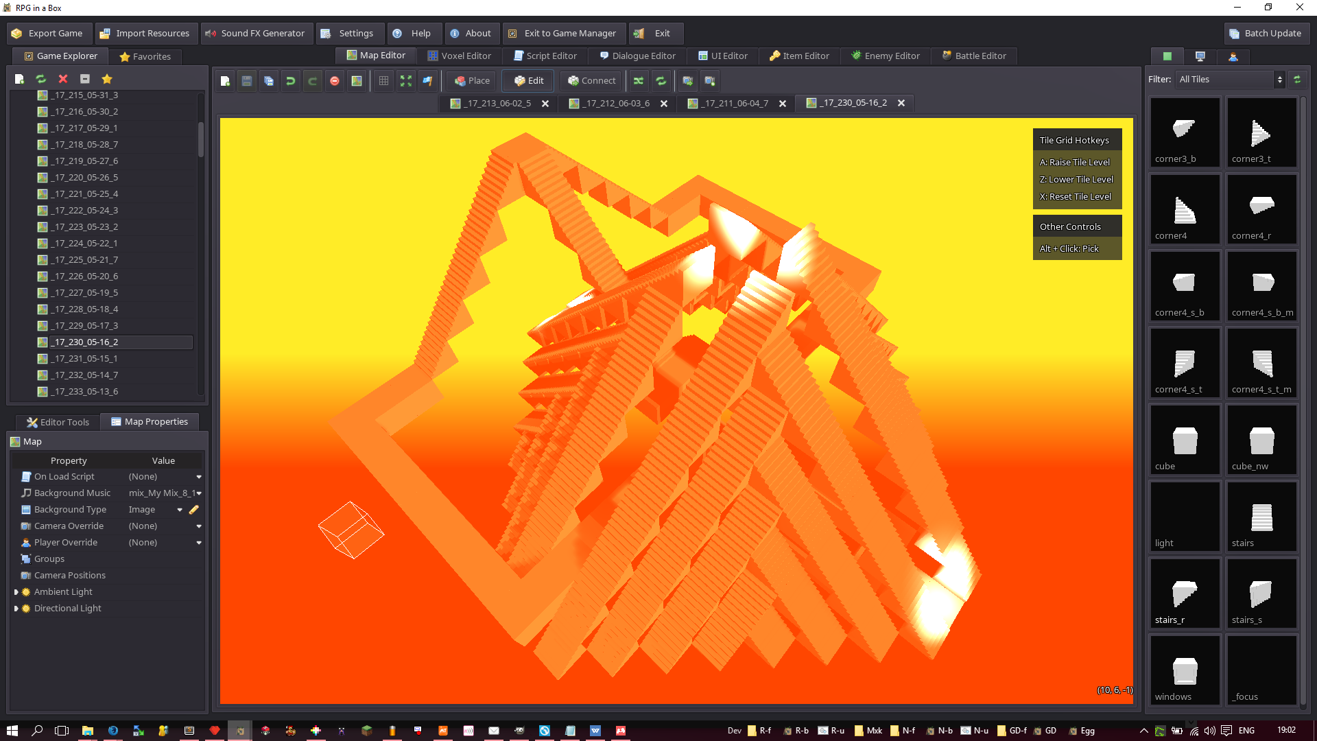
An interesting example of a level that could only be truly appreciated in 3rd person view.
So, what is a “good” level made of? I still don’t know. Especially when the screenshots I don’t like are retweeted way more times than the ones I actually like. I’ve noticed a few patterns that people seem to enjoy more than others : massive symmetric buildings, mask-shaped structures, pseudo-figurative landscapes… But a cool-looking screenshot doesn’t always mean a pleasant level to explore. And yet, screenshots have aesthetic values of their own. Are they a by-product of the game, or the end product?
More importantly, where is the game? In the editor, when I build new levels? In the “playable” interactive sequences? On social networks? In a video streamed by a YouTuber? In the mind of my friends and relatives who understand the game (or don’t)? There are so many ways of experiencing the concept, so many interlinked processes, that I’m not sure where it starts and where it ends.
But that’s probably the point. I’ve always envisioned A Road to Awe as a self-incrementing loop fuelled by the many layers of my daily experiences.
Speaking of which, deciding to drop the 7 blocks width rule was, in my opinion, an excellent idea. It gives me much more space and freedom for interesting structures, while being barely noticed by players (except when they say levels look better). I’m currently sticking with a maximum width equal to the level’s length, which gives a maximum surface of 19×19 blocks, and no vertical limit. So I can finally build cubic levels, something that definitely makes sense in a world made of cubic elements. Why didn’t I think about this earlier, being a cube lover? Because I focused on the “road” part, assuming it had to be more long than wide. That was a logical choice, but a choice implying a figurative, material, not-so abstract approach to what a road can be. Except most of my levels barely look like a road, so what would be the point to follow a pseudo-realistic rule? I say, long live the cubic chaos that link a point to another!
Until next time, you can play the game here: